Data analysis, a pivotal tool in the modern digital landscape, carries immense potential. But like any craft, it requires a nuanced understa...
Data analysis, a pivotal tool in the modern digital landscape, carries immense potential. But like any craft, it requires a nuanced understanding to wield effectively. Missteps in this domain often reverberate with consequences that distort insights, leading not just to misleading outcomes but also to decisions that, with hindsight, feel tragically avoidable. Data is a raw force, a resource, but it demands respect—a respect rooted in the comprehension of its nature and the methods employed to interpret it.
One of the first errors many analysts stumble upon is the age-old conundrum of correlation versus causation. Numbers might suggest a relationship between two variables, but the human mind’s tendency to seek patterns can, at times, become a trap. Simply put, correlation does not imply causation. The elegance of statistical insight is often marred when this distinction is ignored, as it leads to conclusions that merely mirror coincidences rather than actual causal relationships. A cautious and philosophical approach ensures that one does not rush to conclusions without diving deep into the causative mechanics of the data presented.
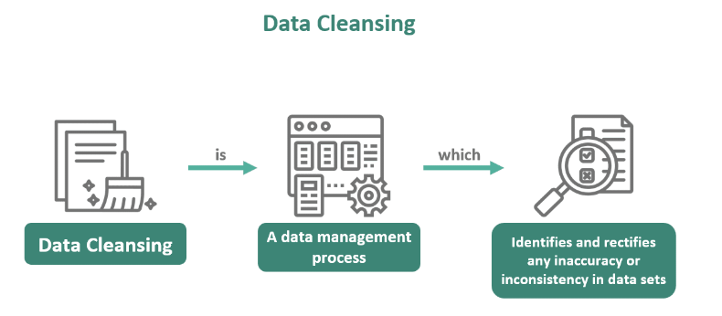
Equally pressing is the need to ensure data cleanliness. The foundations of any analysis rest upon the integrity of the data. Impure, incomplete, or biased data clouds judgment and poisons the well from which insights are drawn. Data is not infallible, and even small inconsistencies can balloon into significant misinterpretations. Ensuring data integrity requires rigorous preprocessing—validation, normalization, and, where necessary, imputation. Failing to clean data properly is akin to constructing a grand edifice on weak, shifting sands, doomed to collapse under its own weight.
Visual representation, while an art in itself, is often misunderstood. Designing clear visualizations is critical. The ability to distill complex datasets into meaningful, digestible visuals is a skill that separates an adept analyst from the rest. A cluttered chart, with too many colors, axes, or data points, overwhelms rather than informs. The simplicity and clarity of the message should always guide the hand that crafts the visualization. Data visualization should not just display numbers; it should tell a story—one that resonates, not confuses.
Metrics and key performance indicators (KPIs) are the bedrock of decision-making. However, setting the right KPIs is more challenging than it appears. Too often, analysts are drawn to the metrics that are easiest to measure rather than those that are most meaningful. A KPI should reflect the true drivers of business success. When wrongly selected, they offer a distorted lens through which success is viewed, leading organizations down misguided paths.
Lastly, and perhaps most critically, data must always be considered within its context. Stripping data of its situational background renders it hollow. Numbers in isolation are meaningless; their significance arises from the environment in which they were produced. Acknowledging the time, conditions, and variables at play ensures that the analysis is rooted in reality. Data without context is like a compass without a map—directionless.
In a world increasingly driven by data, the importance of avoiding these common pitfalls cannot be overstated. Mastery in data analysis comes not just from technical know-how, but from a thoughtful, philosophical approach that acknowledges the limitations of the data and the analyst’s own biases. When this respect is granted, data analysis transforms from a mere task into an art form—an intellectual pursuit that not only informs decisions but also enhances understanding of the complexities of the world we inhabit.
Have you made any of these mistakes before? Or do you have your own tips for better analysis? Let me know in the comments! ⬇️
Author Details:
Syed Salman Mehdi
LinkedIn
Email: salmanmehdi128@gmail.com


No comments